Web & Mobile Information Architecture Product Design

Barré Studio — Simplifying
a "barré" world

Letting a creative studio's site grow with its founder — moving from a showcase to a true portfolio that puts her work front and centre.

My role Solo UI/UX Designer
Duration Ongoing
Tools Figma, Figjam, Claude (prototyping)

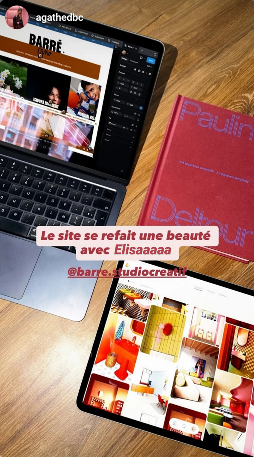
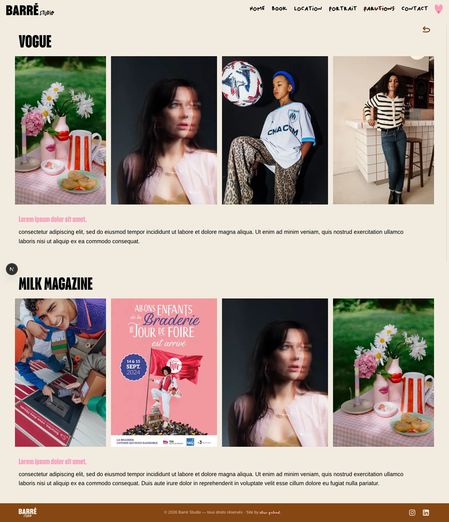
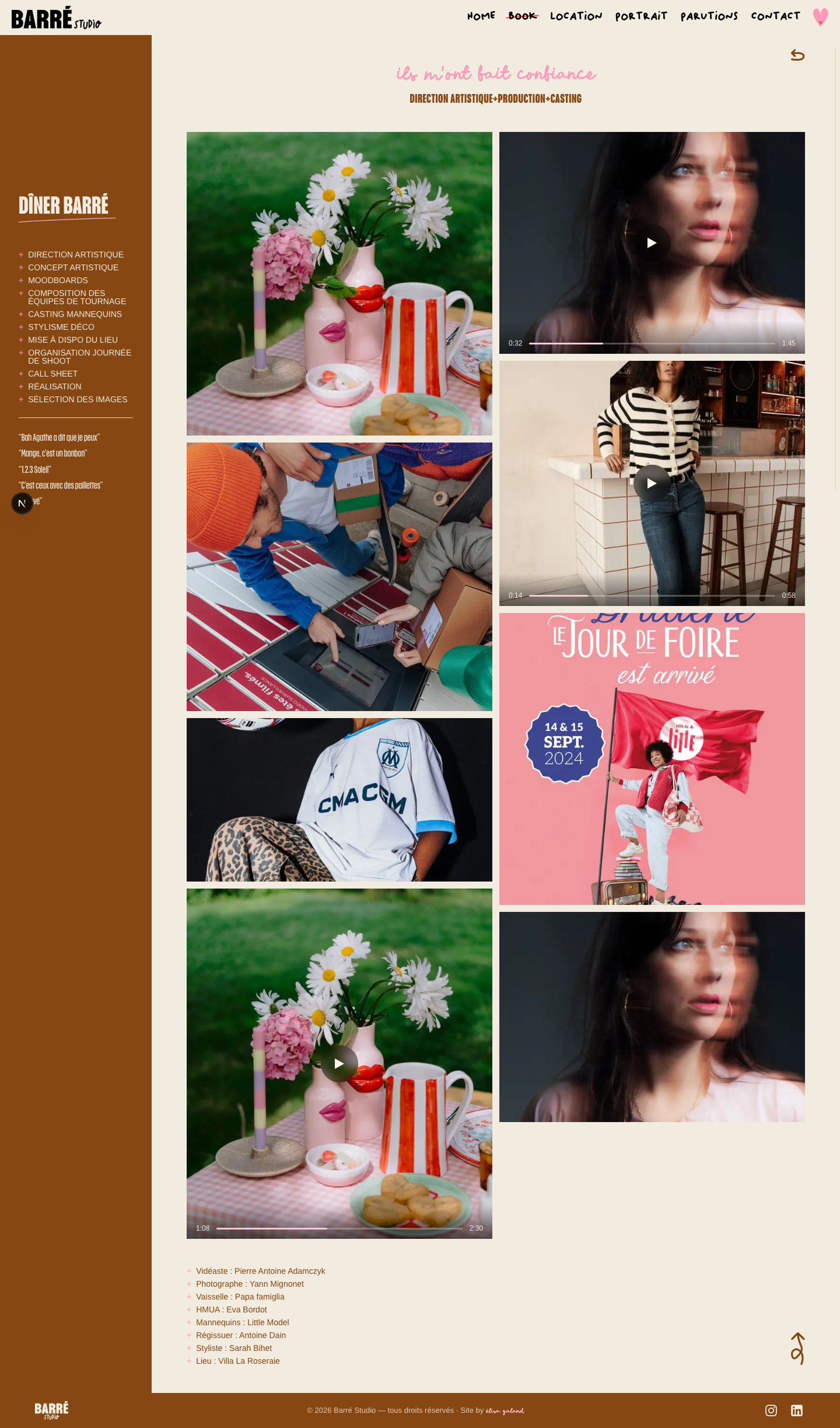
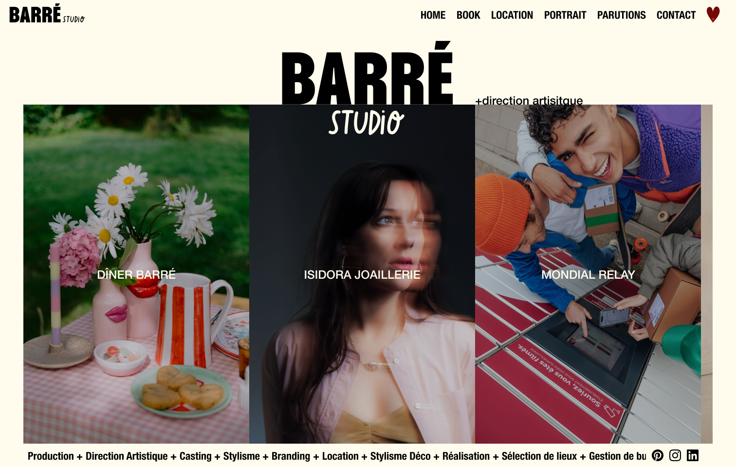
Letting a "barré" world grow up.

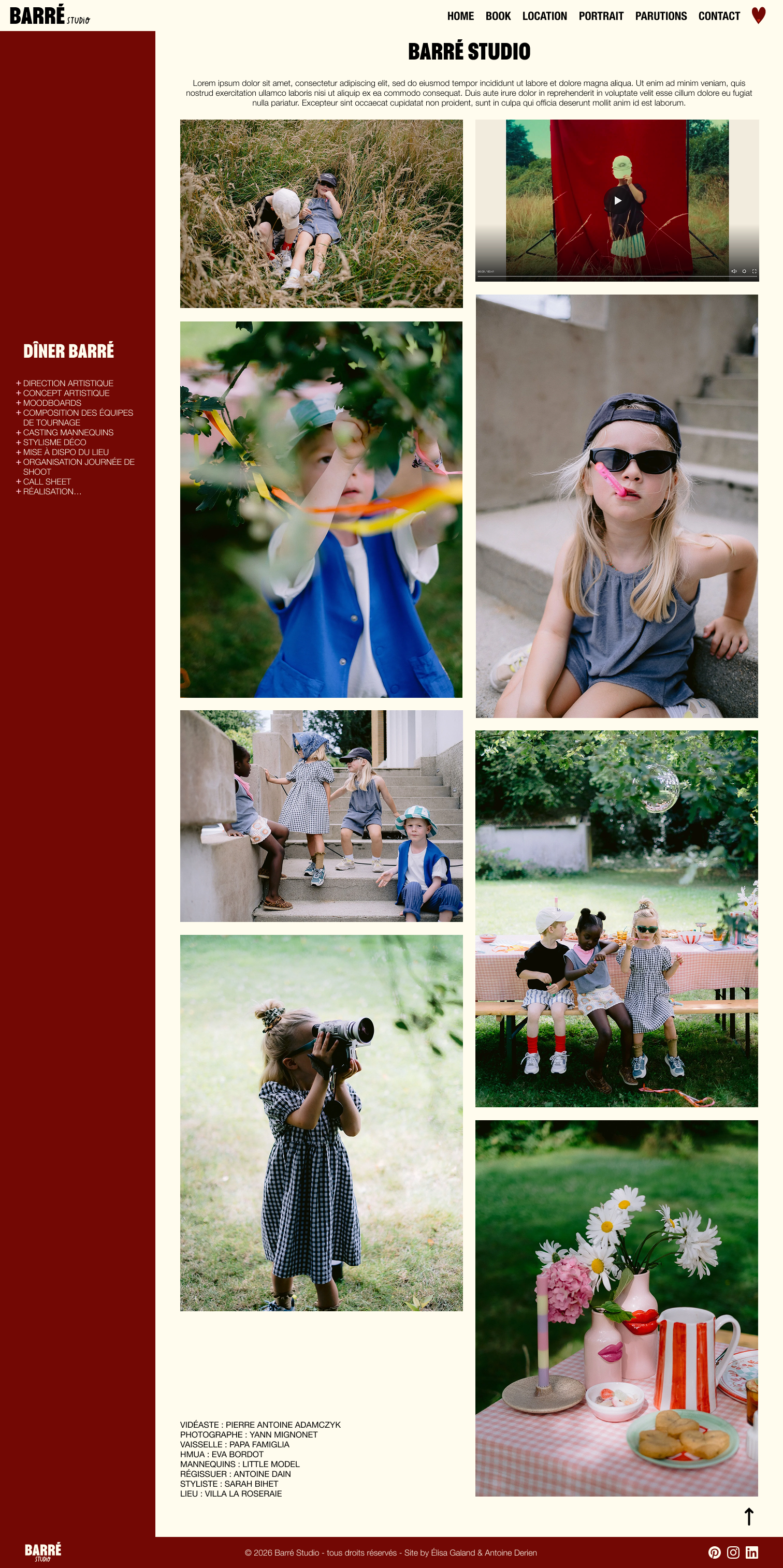
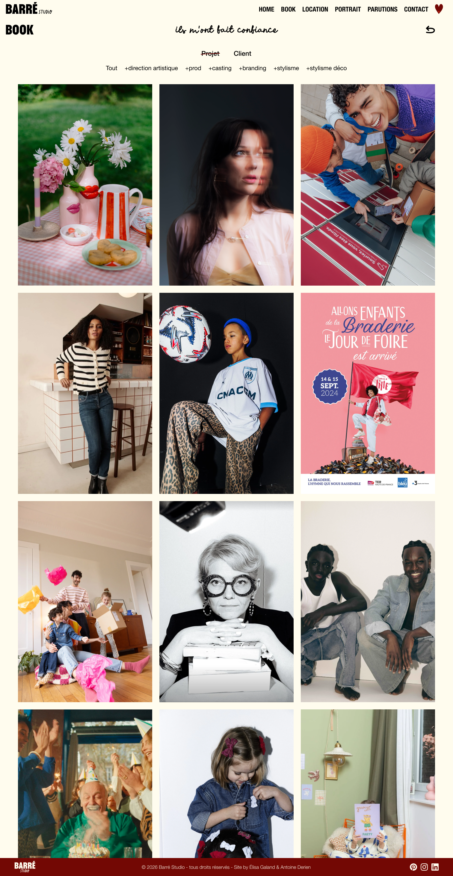
Barré Studio is Agathe Debusschère's agency — art direction + production + casting + styling + … a multi-hat creative who built a recognisable, deliberately barré (off-the-wall) universe.

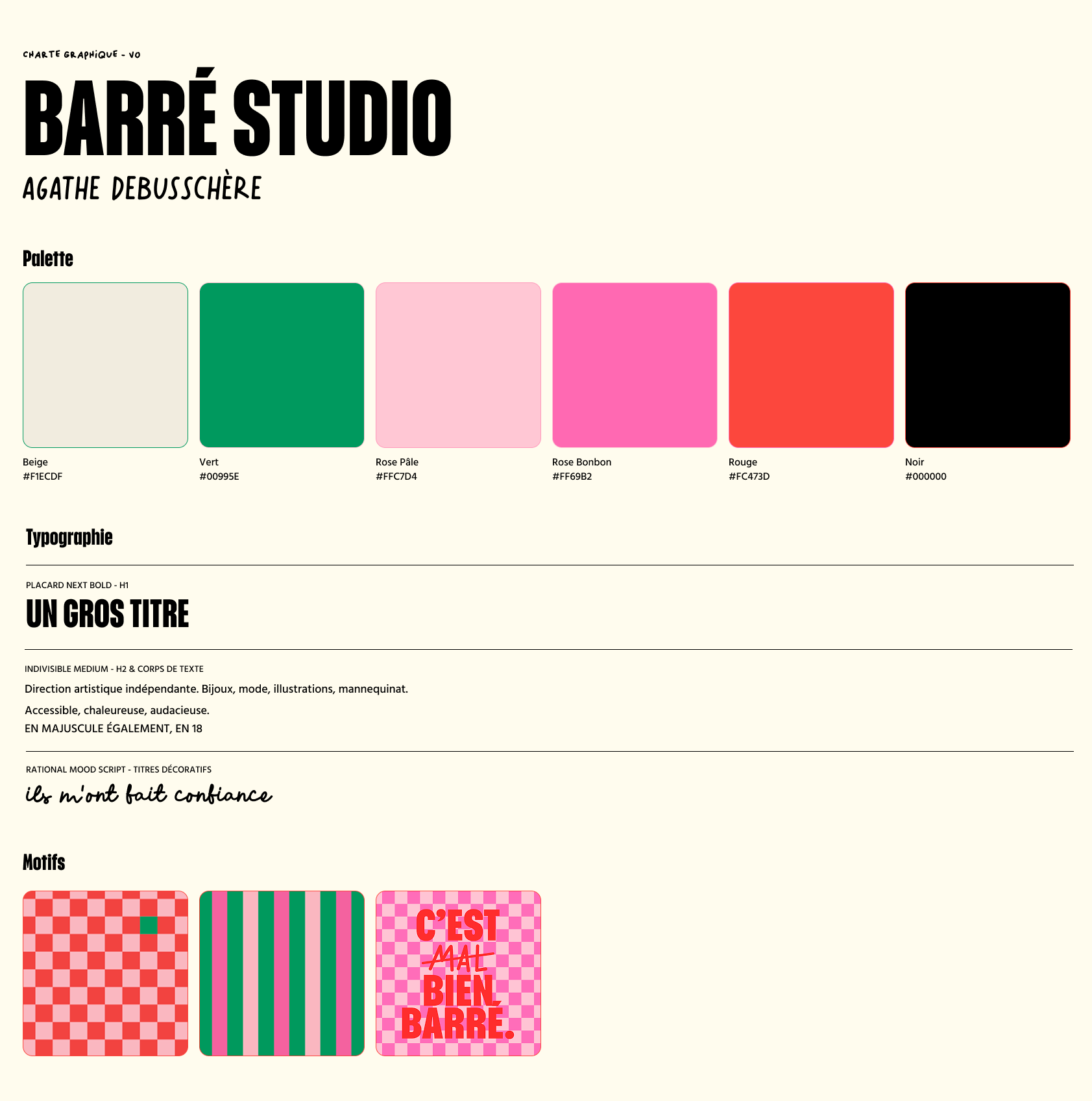
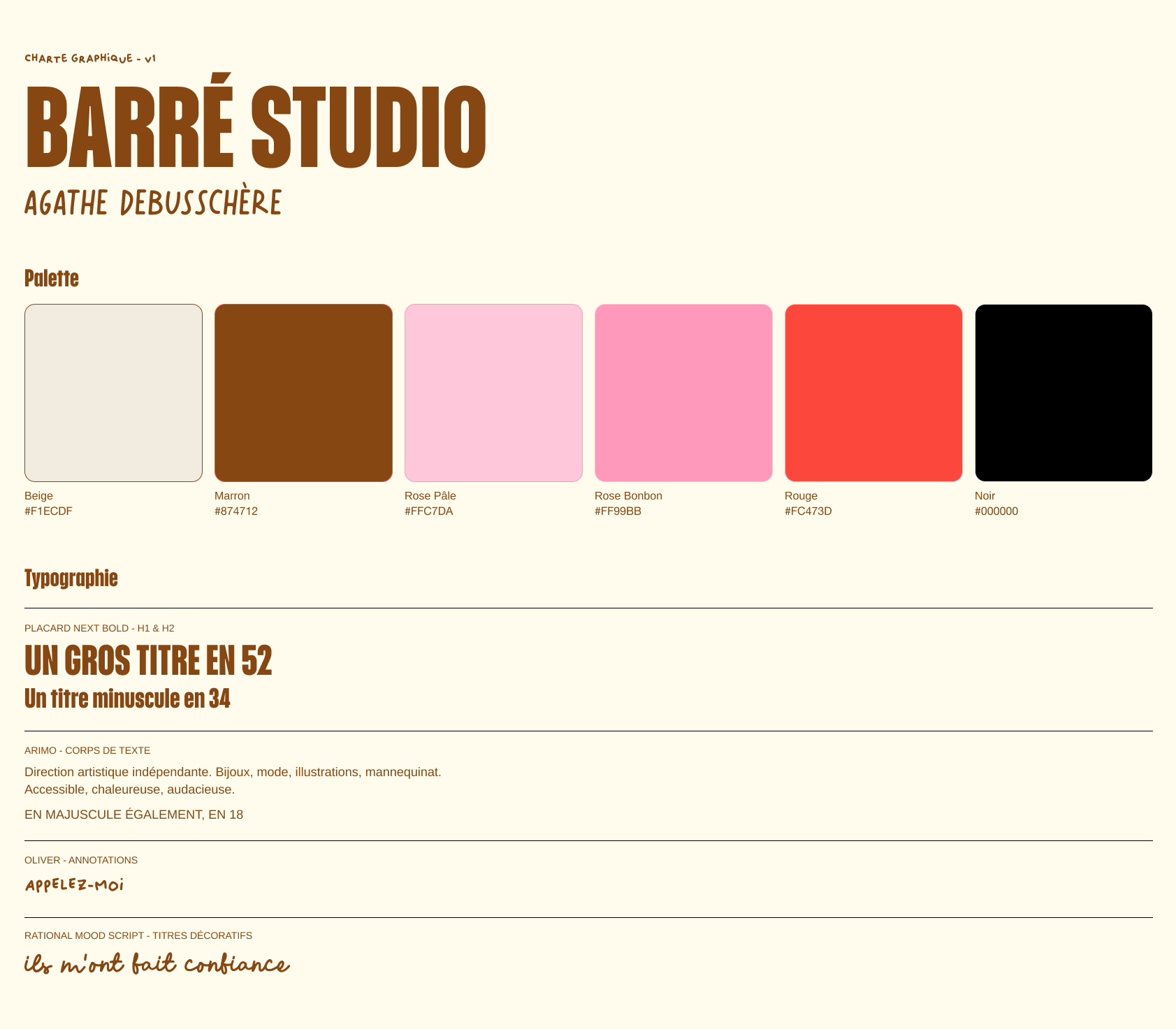
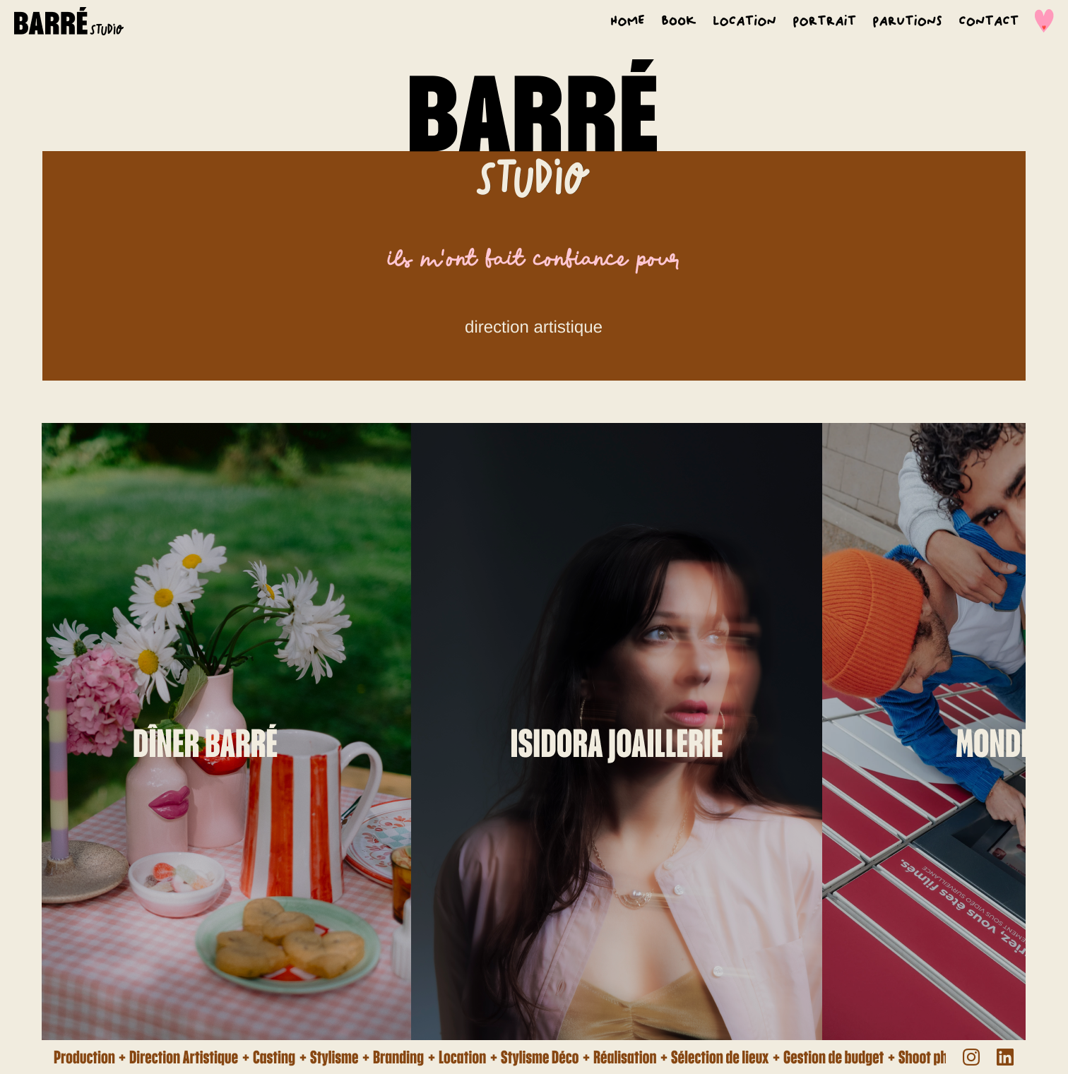
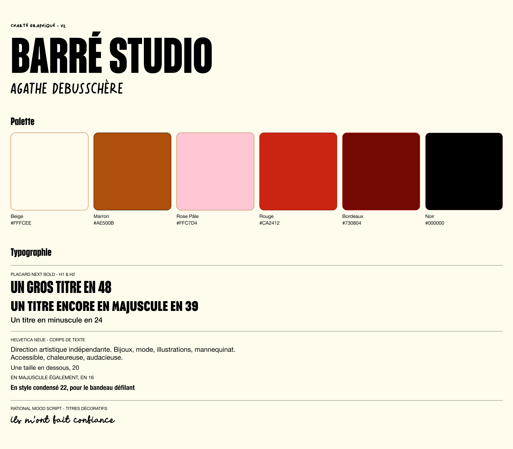
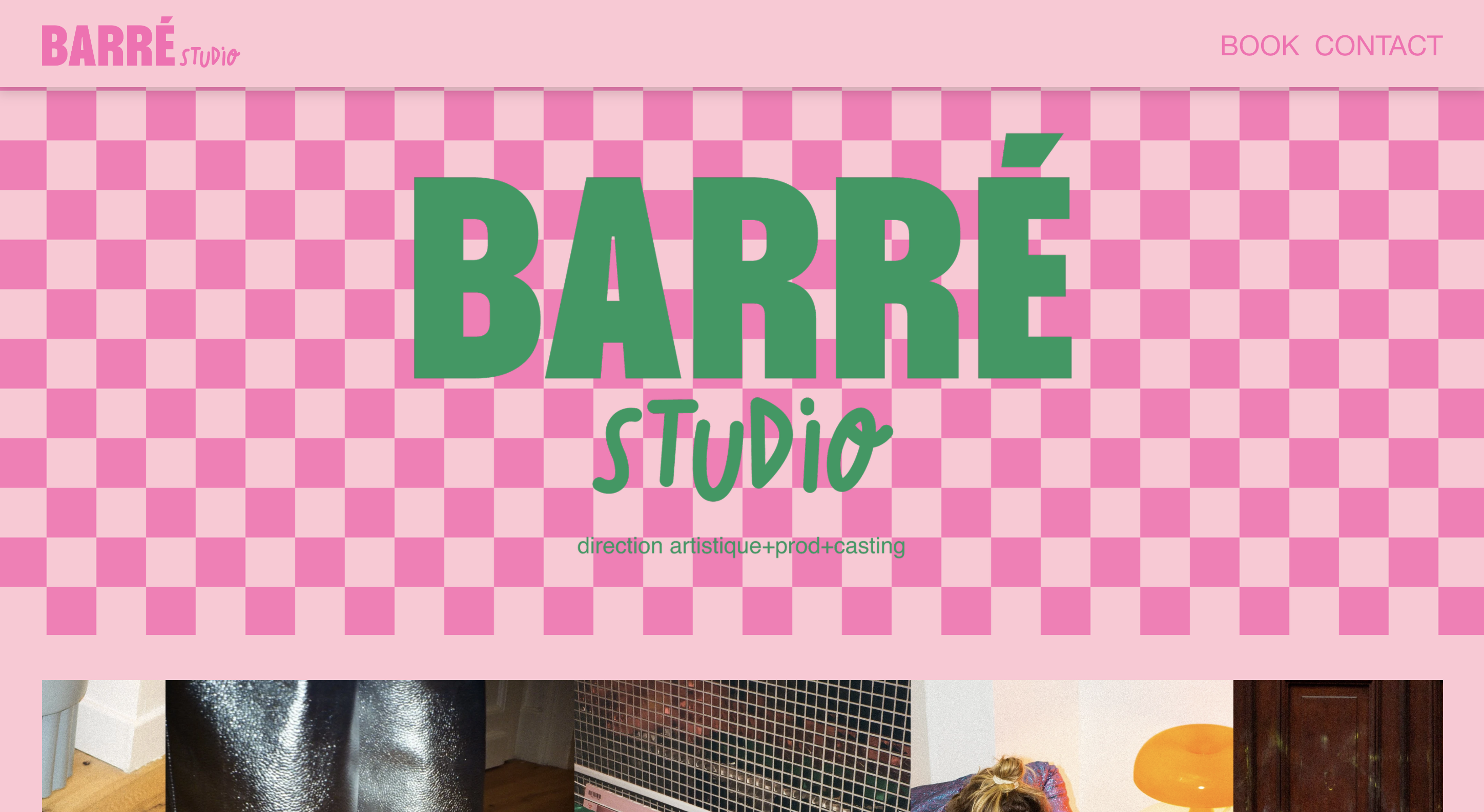
Her site, built two years ago when she opened the agency, faithfully carried her boldness as an art director: vivid colours, pop energy, playful patterns. Unfortunately, the screen was saturated and pushed her artistic and photographic work into the background. Today her style, her needs and her clients have evolved — and so have the trends. It was time for her site to grow with her, without betraying her barrée signature.

Portrait of Agathe Debusschère, art director of Barré Studio

Four visitors, four needs.

The Barré Studio site targets very different clients, reflecting Agathe's multi-hat nature. Identifying each profile shaped the architecture, so it could answer everyone's needs.

Brands & clients

Looking for a casting, a production or a venue. They want to quickly assess Agathe's style and network.

Journalists & press

Come for the press features and Agathe's portrait. They look for direct contact and quick identification cues.

Models & talent

Browse the book and the studio's tone. They look for a signature and a universe they can associate with.

Small brands

Want to rework their visual direction. Looking for a creative partner who gets them, without the weight of a large agency.

A pop universe — a site struggling to carry it.

The old Barré Studio site mirrored Agathe's energy from day one: magnetic at first sight. The catch: the user journey was poorly defined, several pages were missing (rentals, portrait, press), and the omnipresent palette crushed the content instead of elevating it.

V0 brand guidelines — original Barré Studio palette

Laying clear UX foundations.

The first act doesn't touch the identity: we keep a palette close to the original, and shift it from the screen's background to accent touches. The missing pages get added (Rentals, Portrait, Press) and filters are introduced so visitors can quickly find what they need. Result → it breathes again: a cream background replaces the pink checkerboard. The world remains barré, but legible.

V1 brand guidelines — palette and components for Barré Studio V1
Home page — Barré Studio V1 Press page — Barré Studio V1 Contact page — Barré Studio V1
Book page — Barré Studio V1 Rentals page — Barré Studio V1

New architecture

Barré Studio site architecture — pages tree

"I wish my site would put my work forward more. I loved the brand I created, but it crowds out my work and pushes it to the back…"

From studio to portfolio.

Once the architecture was solid, Agathe felt the original palette no longer matched her. This second phase, currently in progress, rethinks the visual signature to refocus the site on what truly matters: her photos, her videos, her eye. Less site, more work.

V2 brand guidelines — new palette and components for Barré Studio
Home page — Barré Studio V2 Book page — Barré Studio V2
More screens coming soon!
Home Book — Barré Studio V2 Contact page — Barré Studio V2

The road travelled.

Old site — pop palette 1 3
Before
Current site — refocused palette 2
After

Home & ambiance

  • 1Take the focus off « Barré Studio » to redirect it to Agathe's visual work.
  • 2Soften the colour palette to avoid overwhelming the eye.
  • 3Remove patterns like the two-tone checkerboard.
Old site — original Book page
Before
Current site — restructured Book page 1 2 2 3
After

Readability & context

  • 1Added 2–3 explanatory lines per project so visitors step into Agathe's world.
  • 2Project name and client name clearly separated.
  • 3Subtle but useful components added, like the scroll-back arrow.
Old site — original Home Book page
Before
Current site — Home Book V2 1 2
After
Current site — Rentals page 3
After — Rentals (V2 coming)

Architecture & navigation

  • 1Filters by project and client to browse the book quickly, without drowning in content — before, you landed on a disorganised page.
  • 2Generous negative space, kept truly white, to let the eye breathe.
  • 3Added Rentals, Portrait and Press pages to answer the needs of Agathe and her clients.

The choices that make the difference.

Animation

  • The site leaves its static state thanks to a few well-placed animations.
  • A nod to the studio's name: hover effects literally "barre" (strike through) the words.
  • On the home page, a scrolling banner displays Agathe's skills.
  • Sticky scroll behaviour to keep essential information by the visitor's side.
Agathe's photos showcased on the home page

Photo & video showcase

  • Agathe's visual work brought to the front with photos straight from the home page.
  • A hover effect that reveals the image clean — no text, no overlay.
  • Spacing that gives the photos plenty of room to breathe.
Filters and navigation

Filters & navigation

  • Filters by project, based on Agathe's skills.
  • Filters by client, to see every project done for the same brand.
  • A user journey tailored to each visitor's needs.

What this project taught me.

Working on a real project with another decision-maker shows the value of collaborative work and of confronting ideas.

Evolving without betraying yourself

Evolving a strong identity means keeping its DNA while making it more readable. The palette doesn't disappear — it changes roles.

One redesign reveals the next

Iterating also means giving the client time to discover themselves. After V1, Agathe realised she didn't just want to improve her site — she wanted to change its style as well.

The site isn't the star

For an art director, the site is a frame. It should step back just enough so the photos, videos and her work can take centre stage.

Less is more

Redesigning is often about removing more than adding. A cream background instead of a pink checkerboard, a palette used as accent rather than being omnipresent — each subtraction makes room for the work.

Next project

Péculéo — Your pocket piggy bank, simple and reassuring

Designing an app that turns saving into a positive everyday habit.

View the case study →